
动画(animation)是CSS3中具有颠覆性的特征之一,可通过设置多个节点来精确控制一个或一组动画,常用来实现复杂的动画效果。
相比于过渡,动画可以实现更多变化,更多控制,连续自动播放等效果。 
1.动画的基本使用
制作动画分为两步:
- 先定义动画
- 在使用(调用动画)
1.1 用keyframes定义动画(类似定义类选择器)
css
@keyframes 动画名称 {
0%{
width:100px;
}
100%{
width:200px;
}
}
动画序列
- 0%是动画的开始,100%是动画的完成。这样的规则就是动画序列。
- 在
@keyframes中规定某项CSS样式,就能创建由当前样式逐渐改为新样式的动画效果。 - 动画是使元素从一种样式逐渐变化为另一种样式的效果。您可以改变任意多的样式任意多的次数。
- 请用百分比来规定变化发生的时间,或用关键词
from和to,等同于0%和100%。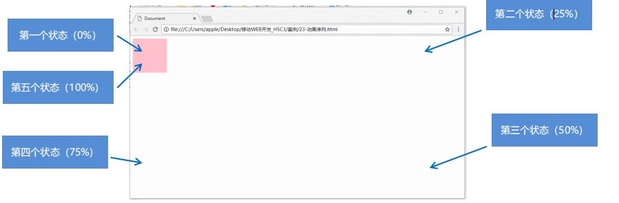
html
<!DOCTYPE html>
<html lang="en">
<head>
    <meta charset="UTF-8">
    <meta name="viewport" content="width=device-width, initial-scale=1.0">
    <title>Document</title>
    <style>
        @keyframes move {
            0% {
                transform: translate(0px,0px);
            }
            25% {
                transform: translate(1000px,0);
            }
            50% {
                transform: translate(1000px,500px);
            }
            75% {
                transform: translate(0,500px);
            }
            100% {
                transform: translate(0,0);
            }
        }
        div {
            height: 100px;
            width: 100px;
            background-color: pink;
            animation-name: move;
            animation-duration: 3s;
        }
    </style>
</head>
<body>
    <div></div>
</body>
</html>
1.2 元素使用动画
css
div {
width: 200px;
height: 200px;
background-color: aqua;
margin: 100px auto;
/* 调用动画 */
animation-name: 动画名称;
/* 持续时间 */
animation-duration: 2s;
}
综合使用
html
<!DOCTYPE html>
<html lang="en">
<head>
    <meta charset="UTF-8">
    <meta name="viewport" content="width=device-width, initial-scale=1.0">
    <title>Document</title>
    <style>
        @keyframes move{
            0% {
                transform: translateX(0px);
            }
            100% {
                transform: translateX(500px);
            }
        }

        div {
            height: 100px;
            width: 100px;
            background-color: pink;
            animation-name: move;
            animation-duration: 3s;
        }
    </style>
</head>
<body>
    <div></div>
</body>
</html>
1.3 动画常用属性
| 属性名 | 描述 | 示例值 |
|---|---|---|
animation-name | 指定动画名称 (必须的) | move |
animation-duration | 动画持续时间 默认是0。(必须的) | 2s |
animation-timing-function | 动画速度曲线 默认是“ease”。 | ease, linear, ease-in |
animation-delay | 动画延迟时间 默认是0。 | 1s |
animation-iteration-count | 规定动画被播放的次数,默认是1,还有infinite无限次 | infinite, 3 |
animation-direction | 规定动画是否在下一周期逆向播放,默认是normal,alternate逆播放 | normal, reverse, alternate |
animation-fill-mode | 规定动画结束后状态,保持forwards回到起始backwards | forwards, backwards |
animation-play-state | 规定动画是否正在运行或暂停 | running, paused |
1.4 速度曲线细节(animation-timing-function)
| 属性值 | 描述 | 效果 |
|---|---|---|
linear | 匀速运动 | 动画从头到尾的速度相同 |
ease | 默认值,慢快慢 | 动画以低速开始,然后加快,在结束前变慢 |
ease-in | 低速开始 | 动画以低速开始 |
ease-out | 低速结束 | 动画以低速结束 |
ease-in-out | 低速开始和结束 | 动画以低速开始和结束 |
steps(n) | 自定义速度曲线 | 在steps函数中定义自己的值 |
html
<!DOCTYPE html>
<html lang="en">
<head>
    <meta charset="UTF-8">
    <meta name="viewport" content="width=device-width, initial-scale=1.0">
    <title>Document</title>
    <style>
        div {
            overflow: hidden;
            font-size: 20px;
            width: 0;
            height: 30px;
            background-color: pink;
            white-space: nowrap;
            animation: w 4s steps(10) forwards;
        }
        @keyframes w {
            0% {

            }
            100% {
                width: 200px;
            }
        }
    </style>
</head>
<body>
    <div>欢迎关注全栈实验室!</div>
</body>
</html>
1.5 动画简写属性
animation: 动画名称 持续时间 运动曲线 何时开始 播放次数 是否反方向 动画起始或者结束的状态;
css
animation: myfirst 5s linear 2s infinite alternate;- 简写属性里面不包含 animation-play-state
- 暂停动画: animation-play-state: puased; 经常和鼠标经过等其他配合使用
- 想要动画走回来,而不是直接跳回来: animation-direction: alternate
- 盒子动画结束后,停在结束位置: animation-fill-mode: forwards
1.6 热点地图案例
使用所学知识完成图片中的样式 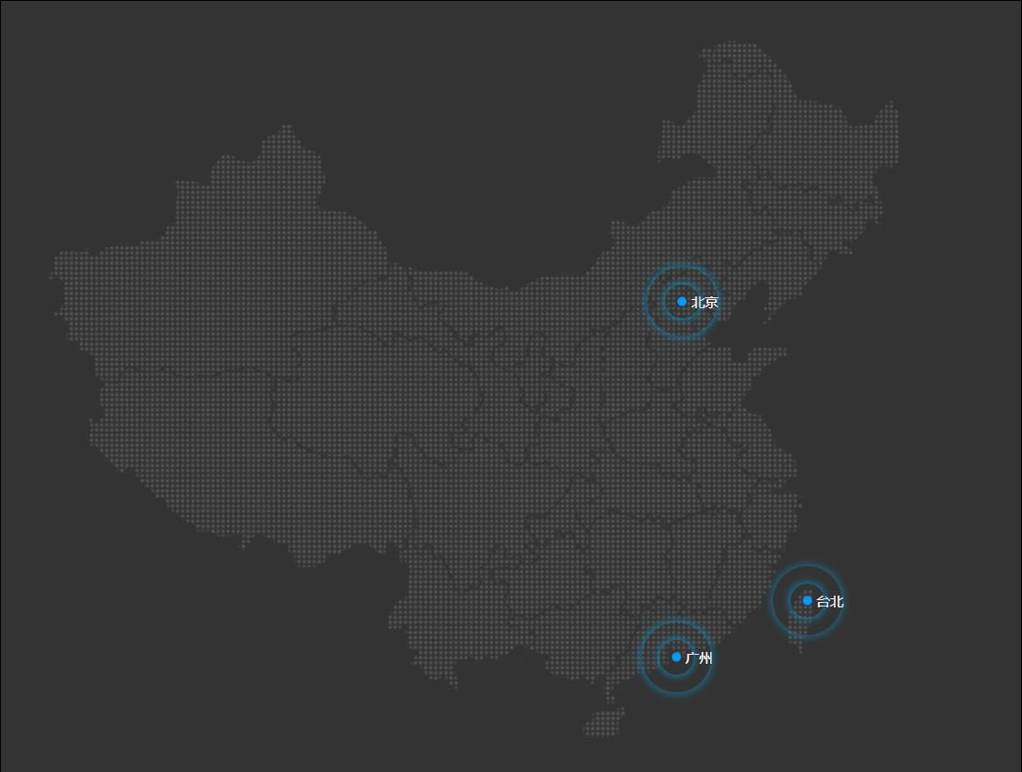
html
<!DOCTYPE html>
<html lang="en">
<head>
    <meta charset="UTF-8">
    <meta name="viewport" content="width=device-width, initial-scale=1.0">
    <title>Document</title>
    <style>
        body {
            background-color: #333;
        }
        .map {
            position: relative;
            width: 747px;
            height: 616px;
            background: url(images/map.png) no-repeat;
            margin: 0 auto;
        }
        .city {
            position: absolute;
            top: 227px;
            right: 193px;
            color: #fff;
        }
        .gz {
            top: 529px;
            right: 187px;
        }
        .tb {
            top: 500px;
            right: 80px;
        }
        .dotted {
            height: 8px;
            width: 8px;
            background-color: #09f;
            border-radius: 50%;
        }
        .city div[class^="pulse"] {
            /* 保证我们小波纹在父盒子里面水平垂直居中 放大之后就会中心向四周发散 */
            position: absolute;
            top: 50%;
            left: 50%;
            transform: translate(-50%,-50%);
            width: 8px;
            height: 8px;
            box-shadow: 0 0 12px #09f;
            border-radius: 50%;
            animation: pulse 1.2s linear infinite;
        }
        .city div.pulse2 {
            animation-delay : 0.4s;
        }

        .city div.pulse3 {
            animation-delay : 0.8s;
        }

        @keyframes pulse{
            0% {}
            70% {
                /* transform: scale(5);  我们不要用scale 因为他会让 阴影变大*/
                width: 40px;
                height: 40px;
                opacity: 1;
            }
            100% {
                width: 70px;
                height: 70px;
                opacity: 0;
            }
        }
    </style>
</head>
<body>
    <div>
        <div class="map">
            <div class="city">
                <div class="dotted"></div>
                <div class="pulse1"></div>
                <div class="pulse2"></div>
                <div class="pulse3"></div>
            </div>
            <div class="city gz">
                <div class="dotted"></div>
                <div class="pulse1"></div>
                <div class="pulse2"></div>
                <div class="pulse3"></div>
            </div>
            <div class="city tb">
                <div class="dotted"></div>
                <div class="pulse1"></div>
                <div class="pulse2"></div>
                <div class="pulse3"></div>
            </div>
        </div>
    </div>
</body>
</html>
1.7 极光下奔跑的熊案例
html
<!DOCTYPE html
PUBLIC "-//W3C//DTD XHTML 1.0 Transitional//EN" "http://www.w3.org/TR/xhtml1/DTD/xhtml1-transitional.dtd">
<html xmlns="http://www.w3.org/1999/xhtml">
<head>
<meta http-equiv="Content-Type" content="text/html; charset=utf-8" />
<title>无标题文档</title>
<style>
body {
margin: 0;
}
html,
body {
width: 100%;
height: 100%;
}
body {
font: 16px "microsoft Yahei";
background: #464853 url(images/bg-container.png) repeat-x;
min-width: 1000px;
min-height: 550px;
}
#main,
#stage,
#sence {
width: 100%;
height: 100%;
overflow: hidden;
}
#main,
#stage {
position: relative;
}
#sence {
position: absolute;
left: 0;
top: 0;
}
/*星空背景图,无缝循环播放。*/
#space {
width: 3840px;
height: 100%;
position: absolute;
left: 0;
top: 0;
background: url(images/bg-space.png) repeat-x;
animation: moving 450s linear infinite;
}
/*整个山的舞台容器,高度是最高的山的背景图片的高度。*/
#mountains {
width: 100%;
height: 17.78125em;
position: absolute;
left: 0;
bottom: 0;
overflow: hidden;
animation: mountains-in 0.8s ease-out forwards;
}
/*宽高使用了em的倍数关系。1em=16px*/
.mountain {
width: 240em;
position: absolute;
left: 0;
bottom: 0;
}
/*第一张山的背景图片,无缝拼接滚动。*/
.mountain-1 {
height: 10.5em;
z-index: 3;
background: url(images/bg-mountain-1.png) repeat-x;
background-size: auto 100%;
animation: moving 100s linear 0.8s infinite;
}
.mountain-2 {
height: 12em;
z-index: 2;
background: url(images/bg-mountain-2.png) repeat-x;
background-size: auto 100%;
animation: moving 160s linear 0.8s infinite;
}
.mountain-3 {
height: 17.78125em;
z-index: 1;
background: url(images/bg-mountain-3.png) repeat-x;
background-size: auto 100%;
animation: moving 360s linear 0.8s infinite;
}
/*熊出没*/
#bear {
position: absolute;
left: -4%;
margin-left: -6.25em;
bottom: 40px;
z-index: 10;
width: 6.25em;
/*8个熊的宽度是1600,图片缩小为一半,800px,每个熊的宽度是100px,100/16=6.25em;*/
height: 3.125em;
background: url(images/bear.png) 0 0 no-repeat;
background-size: 50em 100%;
/*一个熊的宽度是6.25em,8个熊的宽度是50em*/
animation: bear-run-in 3.6s step-end 0.6s forwards, bear-run 0.8s steps(8, end) 4.2s infinite forwards;
/*熊快速跑进画面,然后原地踏步。*/
}
/*熊原地踏步,通过背景的后退感觉熊在前进。*/
#bear.running {
left: 50%;
animation: bear-run 0.8s steps(8, end) infinite;
}
/*极光的样式*/
#lights {
width: 68.22222em;
height: 37.38888em;
position: absolute;
left: 50%;
margin-left: -34.11111em;
top: 0;
}
.light {
width: 100%;
height: 100%;
position: absolute;
left: 0;
top: 0;
opacity: 0;
}
/*极光的规律就是透明度的变化,运动时间为7s,每张图片的间隔是0.5s,所以要连贯起来,需要至少14张图片。*/
.light-1 {
background: url(images/bg-aurora-1.png) no-repeat;
background-size: 100% auto;
animation: lights 7s linear 0.2s infinite;
}
.light-2 {
background: url(images/bg-aurora-2.png) no-repeat;
background-size: 100% auto;
animation: lights 7s linear 0.7s infinite;
}
.light-3 {
background: url(images/bg-aurora-3.png) no-repeat;
background-size: 100% auto;
animation: lights 7s linear 1.2s infinite;
}
.light-4 {
background: url(images/bg-aurora-4.png) no-repeat;
background-size: 100% auto;
animation: lights 7s linear 1.7s infinite;
}
.light-5 {
background: url(images/bg-aurora-5.png) no-repeat;
background-size: 100% auto;
animation: lights 7s linear 2.2s infinite;
}
.light-6 {
background: url(images/bg-aurora-4.png) no-repeat;
background-size: 100% auto;
animation: lights 7s linear 2.7s infinite;
}
.light-7 {
background: url(images/bg-aurora-3.png) no-repeat;
background-size: 100% auto;
animation: lights 7s linear 3.2s infinite;
}
.light-8 {
background: url(images/bg-aurora-2.png) no-repeat;
background-size: 100% auto;
animation: lights 7s linear 3.7s infinite;
}
.light-9 {
background: url(images/bg-aurora-1.png) no-repeat;
background-size: 100% auto;
animation: lights 7s linear 4.2s infinite;
}
.light-10 {
background: url(images/bg-aurora-2.png) no-repeat;
background-size: 100% auto;
animation: lights 7s linear 4.5s infinite;
}
.light-11 {
background: url(images/bg-aurora-3.png) no-repeat;
background-size: 100% auto;
animation: lights 7s linear 5.2s infinite;
}
.light-12 {
background: url(images/bg-aurora-4.png) no-repeat;
background-size: 100% auto;
animation: lights 7s linear 5.7s infinite;
}
.light-13 {
background: url(images/bg-aurora-5.png) no-repeat;
background-size: 100% auto;
animation: lights 7s linear 6.2s infinite;
}
.light-14 {
background: url(images/bg-aurora-4.png) no-repeat;
background-size: 100% auto;
animation: lights 7s linear 6.7s infinite;
}
/*场景样式*/
#sence-content {
width: 16em;
position: absolute;
left: 50%;
top: 50%;
margin: -5em 0 0 -8em;
opacity: 0;
animation: logo 0.4s ease-in 0.2s forwards;
}
#sence-icon {
width: 7em;
height: 7em;
position: relative;
margin: 0 auto 1em;
}
#sence-icon-logo {
width: 100%;
height: 100%;
background: url(images/bg-logo-long.png) no-repeat;
background-size: 168em 7em;
animation: icon 1.6s steps(23, end) 0.8s forwards;
/*有24个步骤图片,但是加上forwards后,只能设置23步骤,最后一步要保持最后状态不变,否则图片会消失。*/
}
#sence-title {
height: 4.444em;
width: 13.204em;
background: url(images/bg-title.png) no-repeat;
background-size: 100%;
margin: 0 auto 1em;
}
@keyframes icon {
0% {
background-position: 0em 0em;
}
100% {
background-position: -161em 0;
}
}
@keyframes logo {
0% {
opacity: 0;
transform: translateY(0);
}
100% {
opacity: 1;
transform: translateY(-50%);
}
}
@keyframes lights {
0% {
opacity: 0;
}
14% {
opacity: 1;
}
28% {
opacity: 0;
}
100% {
opacity: 0;
}
}
@keyframes moving {
0% {
transform: translateX(0);
}
100% {
transform: translateX(-50%);
}
}
@keyframes mountains-in {
0% {
opacity: 0;
transform: scale(1.5);
}
100% {
opacity: 1;
transform: scale(1);
}
}
@keyframes bear-run-in {
/*第一个完步,时间间隔1.38888889%,图片间隔一个熊,位置间隔1.75%*/
0% {
background-position: 0em 0;
left: -4%;
}
1.38888889% {
background-position: -6.25em 0;
left: -2.25%;
}
2.77777778% {
background-position: -12.5em 0;
left: -0.5%;
}
4.16666667% {
background-position: -18.75em 0;
left: 1.25%;
}
5.55555556% {
background-position: -25em 0;
left: 3%;
}
6.94444444% {
background-position: -31.25em 0;
left: 4.75%;
}
8.33333333% {
background-position: -37.5em 0;
left: 6.5%;
}
9.72222222% {
background-position: -43.75em 0;
left: 8.25%;
}
11.11111111% {
background-position: -50em 0;
left: 10%;
}
/*第二个完步开始,时间间隔1.66666667%,间隔一个熊,位置间隔1.5%。速度比第一个完步慢。*/
11.11111111% {
background-position: 0em 0;
left: 10%;
}
12.77777778% {
background-position: -6.25em 0;
left: 11.5%;
}
14.44444444% {
background-position: -12.5em 0;
left: 13%;
}
16.11111111% {
background-position: -18.75em 0;
left: 14.5%;
}
17.77777778% {
background-position: -25em 0;
left: 16%;
}
19.44444444% {
background-position: -31.25em 0;
left: 17.5%;
}
21.11111111% {
background-position: -37.5em 0;
left: 19%;
}
22.77777778% {
background-position: -43.75em 0;
left: 20.5%;
}
24.44444444% {
background-position: -50em 0;
left: 22%;
}
/*第三个完步开始,时间间隔1.94444444%,间隔一个熊,位置间隔1.25%。速度比第二个完步慢。*/
24.44444444% {
background-position: 0em 0;
left: 22%;
}
26.38888889% {
background-position: -6.25em 0;
left: 23.25%;
}
28.33333333% {
background-position: -12.5em 0;
left: 24.5%;
}
30.27777778% {
background-position: -18.75em 0;
left: 25.75%;
}
32.22222222% {
background-position: -25em 0;
left: 27%;
}
34.16666667% {
background-position: -31.25em 0;
left: 28.25%;
}
36.11111111% {
background-position: -37.5em 0;
left: 29.5%;
}
38.05555556% {
background-position: -43.75em 0;
left: 30.75%;
}
40% {
background-position: -50em 0;
left: 32%;
}
/*第四个完步开始,时间间隔2.22222222%,间隔一个熊,位置间隔1%。速度比第三个完步慢。*/
40% {
background-position: 0em 0;
left: 32%;
}
42.22222222% {
background-position: -6.25em 0;
left: 33%;
}
44.44444444% {
background-position: -12.5em 0;
left: 34%;
}
46.66666667% {
background-position: -18.75em 0;
left: 35%;
}
48.88888889% {
background-position: -25em 0;
left: 36%;
}
51.11111111% {
background-position: -31.25em 0;
left: 37%;
}
53.33333333% {
background-position: -37.5em 0;
left: 38%;
}
55.55555556% {
background-position: -43.75em 0;
left: 39%;
}
57.77777778% {
background-position: -50em 0;
left: 40%;
}
/*第五个完步开始,时间间隔2.5%,间隔一个熊,位置间隔0.75%。速度比第四个完步慢。*/
57.77777778% {
background-position: 0em 0;
left: 40%;
}
60.27777778% {
background-position: -6.25em 0;
left: 40.75%;
}
62.77777778% {
background-position: -12.5em 0;
left: 41.5%;
}
65.27777778% {
background-position: -18.75em 0;
left: 42.25%;
}
67.77777778% {
background-position: -25em 0;
left: 43%;
}
70.27777778% {
background-position: -31.25em 0;
left: 43.75%;
}
72.77777778% {
background-position: -37.5em 0;
left: 44.5%;
}
75.27777778% {
background-position: -43.75em 0;
left: 45.25%;
}
77.77777778% {
background-position: -50em 0;
left: 46%;
}
/*第六个完步开始,时间间隔逐步增多2.77777776%,2.77777777%等,间隔一个熊,位置间隔0.5%。速度比第五个完步慢。逐步慢下来*/
77.77777778% {
background-position: 0em 0;
left: 46%;
}
80.55555556% {
background-position: -6.25em 0;
left: 46.5%;
}
83.33333333% {
background-position: -12.5em 0;
left: 47%;
}
86.11111111% {
background-position: -18.75em 0;
left: 47.5%;
}
88.88888889% {
background-position: -25em 0;
left: 48%;
}
91.66666667% {
background-position: -31.25em 0;
left: 48.5%;
}
94.44444444% {
background-position: -37.5em 0;
left: 49%;
}
97.22222222% {
background-position: -43.75em 0;
left: 49.5%;
}
100% {
background-position: -50em 0;
left: 50%;
}
}
@keyframes bear-run {
0% {
background-position: 0em 0;
}
100% {
background-position: -50em 0;
}
}
/*通过em倍数关系设置对象大小,根据屏幕大小设置不同的文字大小,从而改变对象的宽高。*/
@media screen and (max-height:500px) {
body {
font-size: 14px;
}
}
@media screen and (min-width:1280px) {
body {
font-size: 16px;
}
@media screen and (min-width:1440px) {
body {
font-size: 18px;
}
@media screen and (min-width:1600px) {
body {
font-size: 22px;
}
@media screen and (min-width:1920px) {
body {
font-size: 24px;
}
}
</style>
<script>
window.onload = function () {
var oBear = document.getElementById("bear");
setTimeout(running, 5000);//延迟5秒,加载一个class为running。
function running() {
oBear.className = "running";
}
}
</script>
</head>
<body>
<div id="main">
<div id="stage">
<div id="space"></div>
<div id="mountains">
<div class="mountain mountain-1"></div>
<div class="mountain mountain-2"></div>
<div class="mountain mountain-3"></div>
</div>
<div id="bear"></div>
<div id="lights">
<div class="light light-1"></div>
<div class="light light-2"></div>
<div class="light light-3"></div>
<div class="light light-4"></div>
<div class="light light-5"></div>
<div class="light light-6"></div>
<div class="light light-7"></div>
<div class="light light-8"></div>
<div class="light light-9"></div>
<div class="light light-10"></div>
<div class="light light-11"></div>
<div class="light light-12"></div>
<div class="light light-13"></div>
<div class="light light-14"></div>
</div>
</div>
<div id="sence">
<div id="sence-content">
<div id="sence-icon">
<div id="sence-icon-logo"></div>
</div>
<div id="sence-title"></div>
</div>
</div>
</div>
</body>
</html>